HOW TO MAKE ANIMATED IMAGE HOVER EFFECT USING HTML & CSS
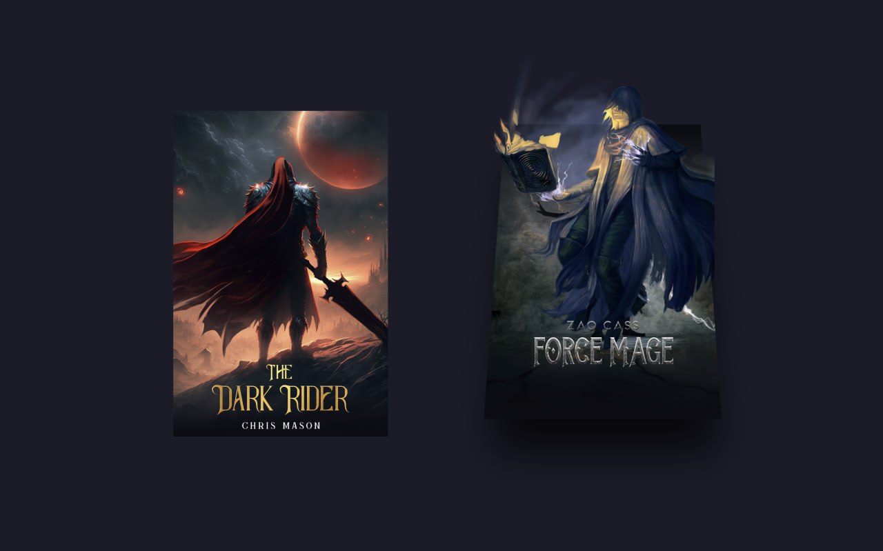
In this project we will create a stylish image hover effect using HTML and CSS. When the user hovers over the images, smooth animations and transitions create an attractive visual effect. This project helps beginners understand how CSS hover effects and animations can be used to build modern UI designs.
Technologies Used
- HTML – structure of the image layout
- CSS – styling, hover effects and animations
HTML Code
<!DOCTYPE html>
<html lang="en">

<head>
    <meta charset="UTF-8">
    <meta name="viewport" content="width=device-width, initial-scale=1.0">
    <title>Image Hover Effect | @EduCrush</title>
    <link rel="stylesheet" href="style.css">
</head>

<body>

    <div class="box">
        <div class="imgBx">
            <img src="img1.jpeg">
        </div>
        <div class="imgBx">
            <img src="img1.jpeg">
        </div>
    </div>

    <div class="box">
        <div class="imgBx">
            <img src="img2.jpeg">
        </div>
        <div class="imgBx">
            <img src="img2.jpeg">
        </div>
    </div>

</body>

</html>
CSS Code
*{
    padding: 0px;
    margin: 0px;
    box-sizing: border-box;
}

body{
    display: flex;
    justify-content: center;
    align-items: center;
    flex-wrap: wrap;
    min-height: 100vh;
}

.box{
    position: relative;
    width: 310px;
    height: 550px;
    margin: 50px;
    cursor: pointer;
}

.box .imgBx{
    position: absolute;
    top: 0;
    left: 0;
    width: 100%;
    height: 100%;
}

.box .imgBx img{
    position: absolute;
    top: 0;
    left: 0;
    width: 100%;
    height: 100%;
    object-fit: cover;
}

.box::before{
    content: '';
    position: absolute;
    top: 0;
    left: 0;
    width: 100%;
    height: 6px;
    background: white;
    z-index: 1000;
    transition: 1.5s;
}

.box:hover::before{
    top: calc(100% - 4px);
}


.box .imgBx:nth-child(1){
    filter: grayscale(1) contrast(8);
}

.box .imgBx:nth-child(2){
    clip-path: polygon(0 0 , 100% 0 , 100% 0 , 0 0);
    transition: 1.5s;
}

.box:hover .imgBx:nth-child(2){
    clip-path: polygon(0 0 , 100% 0 , 100% 100% , 0 100%);
    transition: 1.5s;
}
Conclusion
In this project we created an animated image hover effect using HTML and CSS. By using CSS transitions and hover animations we were able to build a visually attractive effect that enhances the user experience. Projects like this help beginners understand how simple CSS techniques can be used to create modern and interactive UI designs. You can use similar hover effects in galleries, portfolios and modern website layouts.
For more programming projects, source codes and notes join the EduCrush Telegram channel.
Join Telegram