How to Make Animated Electric Card using HTML & CSS
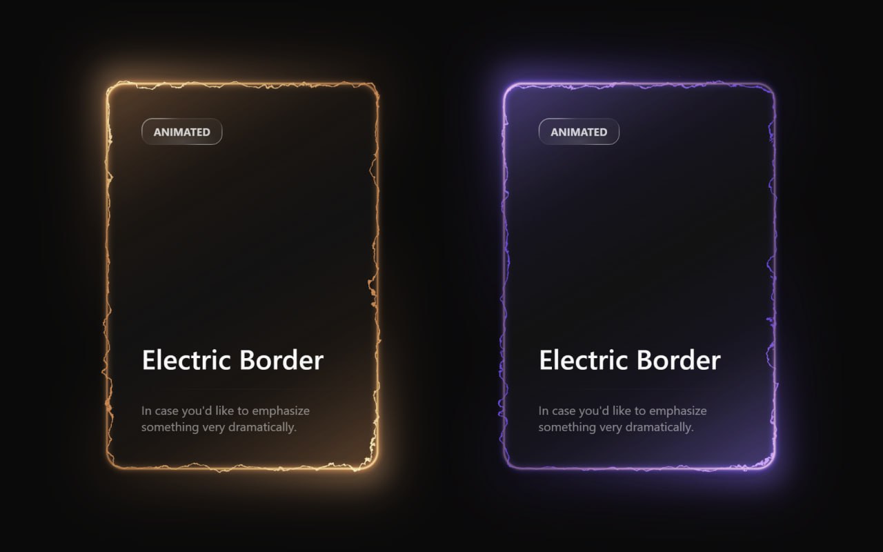
Below is the preview of the animated electric border card that we will create in this tutorial. This stylish card uses glowing electric border effects and smooth animations to create a modern UI component. The animation reacts smoothly and gives a futuristic look that can be used in portfolios, landing pages, or project showcases.
Technologies Used
- HTML – structure of the electric card
- CSS – styling and animation
HTML Code
<!DOCTYPE html>
<html lang="en">

<head>
  <meta charset="UTF-8">
  <title>Animated Electric Card | EduCrush</title>
  <link rel="stylesheet" href="./style.css">
</head>

<body>
<main class="main-container">

  <svg class="svg-container">
    <defs>
      <filter id="turbulent-displace" colorInterpolationFilters="sRGB" x="-20%" y="-20%" width="140%" height="140%">

        <feTurbulence type="turbulence" baseFrequency="0.02" numOctaves="10" result="noise1" seed="1" />

        <feOffset in="noise1" dx="0" dy="0" result="offsetNoise1">
          <animate attributeName="dy" values="700; 0" dur="6s" repeatCount="indefinite" calcMode="linear" />
        </feOffset>

        <feTurbulence type="turbulence" baseFrequency="0.02" numOctaves="10" result="noise2" seed="1" />

        <feOffset in="noise2" dx="0" dy="0" result="offsetNoise2">
          <animate attributeName="dy" values="0; -700" dur="6s" repeatCount="indefinite" calcMode="linear" />
        </feOffset>

        <feTurbulence type="turbulence" baseFrequency="0.02" numOctaves="10" result="noise1" seed="2" />

        <feOffset in="noise1" dx="0" dy="0" result="offsetNoise3">
          <animate attributeName="dx" values="490; 0" dur="6s" repeatCount="indefinite" calcMode="linear" />
        </feOffset>

        <feTurbulence type="turbulence" baseFrequency="0.02" numOctaves="10" result="noise2" seed="2" />

        <feOffset in="noise2" dx="0" dy="0" result="offsetNoise4">
          <animate attributeName="dx" values="0; -490" dur="6s" repeatCount="indefinite" calcMode="linear" />
        </feOffset>

        <feComposite in="offsetNoise1" in2="offsetNoise2" result="part1" />
        <feComposite in="offsetNoise3" in2="offsetNoise4" result="part2" />

        <feBlend in="part1" in2="part2" mode="color-dodge" result="combinedNoise" />

        <feDisplacementMap in="SourceGraphic" in2="combinedNoise" scale="30" xChannelSelector="R" yChannelSelector="B" />

      </filter>
    </defs>
  </svg>

  <div class="card-container card-orange">

    <div class="inner-container">

      <div class="border-outer">
        <div class="main-card"></div>
      </div>

      <div class="glow-layer-1"></div>
      <div class="glow-layer-2"></div>

    </div>

    <div class="overlay-1"></div>
    <div class="overlay-2"></div>
    <div class="background-glow"></div>

    <div class="content-container">

      <div class="content-top">
        <div class="scrollbar-glass">Electric</div>
        <p class="title">Power Card</p>
      </div>

      <hr class="divider" />

      <div class="content-bottom">
        <p class="description">
          Unleash the full potential of animated electric effects.
        </p>
      </div>

    </div>

  </div>

  <div class="card-container">

    <div class="inner-container">

      <div class="border-outer">
        <div class="main-card"></div>
      </div>

      <div class="glow-layer-1"></div>
      <div class="glow-layer-2"></div>

    </div>

    <div class="overlay-1"></div>
    <div class="overlay-2"></div>
    <div class="background-glow"></div>

    <div class="content-container">

      <div class="content-top">
        <div class="scrollbar-glass">EduCrush</div>
        <p class="title">EduCrush</p>
      </div>

      <hr class="divider" />

      <div class="content-bottom">
        <p class="description">
          In case you'd like to emphasize something very dramatically.
        </p>
      </div>

    </div>

  </div>

</main>
</body>
</html>
CSS Code
/* EduCrush | Aman Singh */
:root {
  --electric-border-color: #6348dd;
  --electric-light-color: oklch(from var(--electric-border-color) l c h);
  --gradient-color: oklch(
    from var(--electric-border-color) 0.3 calc(c / 2) h / 0.4
  );
  --color-neutral-900: oklch(0.185 0 0);

  /* Red card colors */
  --electric-border-color-red: #ff4444;
  --electric-light-color-red: oklch(from var(--electric-border-color-red) l c h);
  --gradient-color-red: oklch(
    from var(--electric-border-color-red) 0.3 calc(c / 2) h / 0.4
  );

  /* Orange card colors */
  --electric-border-color-orange: #ff8800;
  --electric-light-color-orange: oklch(from var(--electric-border-color-orange) l c h);
  --gradient-color-orange: oklch(
    from var(--electric-border-color-orange) 0.3 calc(c / 2) h / 0.4
  );
}

* {
  margin: 0;
  padding: 0;
  box-sizing: border-box;
}

body {
  font-family: system-ui, -apple-system, sans-serif;
  background-color: oklch(0.145 0 0);
  color: oklch(0.985 0 0);
  height: 100vh;
  overflow: hidden;
}

/* Main container */
.main-container {
  display: flex;
  flex-direction: row;
  align-items: center;
  justify-content: center;
  gap: 40px;
  height: 100vh;
  padding: 20px;
  flex-wrap: wrap;
}

/* SVG positioning */
.svg-container {
  position: absolute;
}

/* Card container */
.card-container {
  padding: 2px;
  border-radius: 24px;
  position: relative;
  background: linear-gradient(
      -30deg,
      var(--gradient-color),
      transparent,
      var(--gradient-color)
    ),
    linear-gradient(
      to bottom,
      var(--color-neutral-900),
      var(--color-neutral-900)
    );
}

/* Red card variant */
.card-red {
  --electric-border-color: var(--electric-border-color-red);
  --electric-light-color: var(--electric-light-color-red);
  --gradient-color: var(--gradient-color-red);
}

/* Orange card variant */
.card-orange {
  --electric-border-color: var(--electric-border-color-orange);
  --electric-light-color: var(--electric-light-color-orange);
  --gradient-color: var(--gradient-color-orange);
}

/* Inner container */
.inner-container {
  position: relative;
}

/* Border layers */
.border-outer {
  border: 2px solid rgba(72, 87, 221, 0.5);
  border-radius: 24px;
  padding-right: 4px;
  padding-bottom: 4px;
}

.main-card {
  width: 350px;
  height: 500px;
  border-radius: 24px;
  border: 2px solid var(--electric-border-color);
  margin-top: -4px;
  margin-left: -4px;
  filter: url(#turbulent-displace);
}

/* Glow effects */
.glow-layer-1 {
  border: 2px solid rgba(221, 132, 72, 0.6);
  border-radius: 24px;
  width: 100%;
  height: 100%;
  position: absolute;
  top: 0;
  left: 0;
  right: 0;
  bottom: 0;
  filter: blur(1px);
}

.glow-layer-2 {
  border: 2px solid var(--electric-light-color);
  border-radius: 24px;
  width: 100%;
  height: 100%;
  position: absolute;
  top: 0;
  left: 0;
  right: 0;
  bottom: 0;
  filter: blur(4px);
}

/* Overlay effects */
.overlay-1 {
  position: absolute;
  width: 100%;
  height: 100%;
  top: 0;
  left: 0;
  right: 0;
  bottom: 0;
  border-radius: 24px;
  opacity: 1;
  mix-blend-mode: overlay;
  transform: scale(1.1);
  filter: blur(16px);
  background: linear-gradient(
    -30deg,
    white,
    transparent 30%,
    transparent 70%,
    white
  );
}

.overlay-2 {
  position: absolute;
  width: 100%;
  height: 100%;
  top: 0;
  left: 0;
  right: 0;
  bottom: 0;
  border-radius: 24px;
  opacity: 0.5;
  mix-blend-mode: overlay;
  transform: scale(1.1);
  filter: blur(16px);
  background: linear-gradient(
    -30deg,
    white,
    transparent 30%,
    transparent 70%,
    white
  );
}

/* Background glow */
.background-glow {
  position: absolute;
  width: 100%;
  height: 100%;
  top: 0;
  left: 0;
  right: 0;
  bottom: 0;
  border-radius: 24px;
  filter: blur(32px);
  transform: scale(1.1);
  opacity: 0.3;
  z-index: -1;
  background: linear-gradient(
    -30deg,
    var(--electric-light-color),
    transparent,
    var(--electric-border-color)
  );
}

/* Content container */
.content-container {
  position: absolute;
  top: 0;
  left: 0;
  right: 0;
  bottom: 0;
  width: 100%;
  height: 100%;
  display: flex;
  flex-direction: column;
}

/* Content sections */
.content-top {
  display: flex;
  flex-direction: column;
  padding: 48px;
  padding-bottom: 16px;
  height: 100%;
}

.content-bottom {
  display: flex;
  flex-direction: column;
  padding: 48px;
  padding-top: 16px;
}

/* Scrollbar glass component */
.scrollbar-glass {
  background: radial-gradient(
      47.2% 50% at 50.39% 88.37%,
      rgba(255, 255, 255, 0.12) 0%,
      rgba(255, 255, 255, 0) 100%
    ),
    rgba(255, 255, 255, 0.04);
  position: relative;
  transition: background 0.3s ease;
  border-radius: 14px;
  width: fit-content;
  height: fit-content;
  padding: 8px 16px;
  text-transform: uppercase;
  font-weight: bold;
  font-size: 14px;
  color: rgba(255, 255, 255, 0.8);
}

.scrollbar-glass:hover {
  background: radial-gradient(
      47.2% 50% at 50.39% 88.37%,
      rgba(255, 255, 255, 0.12) 0%,
      rgba(255, 255, 255, 0) 100%
    ),
    rgba(255, 255, 255, 0.08);
}

.scrollbar-glass::before {
  content: "";
  position: absolute;
  top: 0;
  left: 0;
  right: 0;
  bottom: 0;
  padding: 1px;
  background: linear-gradient(
    150deg,
    rgba(255, 255, 255, 0.48) 16.73%,
    rgba(255, 255, 255, 0.08) 30.2%,
    rgba(255, 255, 255, 0.08) 68.2%,
    rgba(255, 255, 255, 0.6) 81.89%
  );
  border-radius: inherit;
  mask: linear-gradient(#fff 0 0) content-box, linear-gradient(#fff 0 0);
  mask-composite: xor;
  -webkit-mask-composite: xor;
  pointer-events: none;
}

/* Typography */
.title {
  font-size: 36px;
  font-weight: 500;
  margin-top: auto;
}

.description {
  opacity: 0.5;
}

/* Divider */
.divider {
  margin-top: auto;
  border: none;
  height: 1px;
  background-color: currentColor;
  opacity: 0.1;
  mask-image: linear-gradient(to right, transparent, black, transparent);
  -webkit-mask-image: linear-gradient(
    to right,
    transparent,
    black,
    transparent
  );
}

/* EduCrush | Aman Singh */
Conclusion
In this tutorial we created an animated electric border card using HTML and CSS. By using modern CSS techniques such as animations, gradients and visual effects, we were able to build a stylish and interactive UI component. Projects like this help beginners understand how powerful CSS can be for creating modern web designs without using JavaScript. You can use this animated card in portfolios, landing pages and modern website layouts to make the interface more attractive.
For more programming projects, source codes and notes join the EduCrush Telegram channel.
Join Telegram